Friday, June 3, 2011
Last Post
This is the last time I will be posting on this communication design blog since it is the last day of the class. I'm a little disappointed since it has been a fun, interesting, and informative class. I would definitely like to learn more about graphic design and do more projects similar to the fifteen (+1 extra) I have posted on this blog. It has been a lot of fun. Thanks for taking the time to look at my postings!
Entry Fifteen: Example of a Good Product Design

One product I enjoy is my heels by Jessica Simpson. Since I'm a mom, I love the little things that help remind me that, first of all, I am a woman. This particular pair stands out to me because of their unique design and color. This peep-toe, back-strap design creates a flirty and fun feeling while the color (gold) is sophisticated and glamorous. They look sexy and feel great to wear. The label printed inside the shoes is simply the designer's name, Jessica Simpson, in a script type. Although I love the shoes, I don't care much about the name printed inside them. Good thing the logo doesn't show when I'm sporting them with a cute outfit (no offense, Jessica).

Wednesday, June 1, 2011
Entry Eleven: Myth in Advertising

The message of the advertisement is that a nutritious breakfast helps to provide energy and boost performance and Breakfast Essentials have the vitamins and nutrients necessary to do just that. The use of myth (i.e. over-sized backpacks) works to demonstrate the lack of energy and hindered performance of students who do not consume adequate breakfasts. Although the image is exaggerated, the ad "works" by visually communicating this message. In fact, it is not necessary to read the print to understand the message. One can gather the message by the photo and the image of the product.
Tuesday, May 31, 2011
Entry Nine: Logos and Colors
 Apple Inc. is one of the most easily recognized brands based solely on an iconic symbol. The image of an apple with a bite taken off the side can be in several different colors but all modern Apple devices have a "chrome" appearance. Founded in 1976, the company has modernized its image as it has grown from being Apple Computer, Inc. to Apple Inc.-- Essentially noting the broad array of new tech devices now offered.
  I found this logo online for a company called Burns Music Studios. This is bar far one of the most appealing logos I've seen. The image is a creative blend of a fire (after the company name "Burns") and a musical note (demonstrating what the company is about). The colors are in the red-orange family (secondary colors) but are not bright and overbearing. It looks modern, unique, and sophisticated.
Monday, May 30, 2011

Sunday, May 29, 2011

Entry Fourteen: The Overuse of Papyrus Font


I wasn't able to find an example at this time (although I see it quite frequently ordinarily) so this example is from online, http://dexb.net/img2/font.jpg
Entry Twelve: Handwritten Text in Advertising

This advertisement "works" in the sense that it provides information in a manner that seems more 'real' or personalized. Here, an actual medical doctor is personally telling the reader about the quality care offered at the hospital. The large, bold lettering of the statement, "If you want to know where to take your injured child, ask a paramedic" provides emphasis to the reader and also serves as an eye-catching feature-- making the reader want to read more to understand the statement better. Reference numbers within the text correlate with the right side bar which provides additional clarification and legitimizes the doctors handwritten note. The advertisement is effective in providing information and demonstrating the exceptional level of care at the hospital. Because the advertisement is handwritten by a doctor at the hospital, it may give the reader a message that if the hospital staff is willing to take the time to hand-write a message, they must be willing to take the time and truly care about sick or injured children. At least, that's the message I received with this advertisement.
Some drawbacks of the advertisement is that it lacks brevity. It's hard to miss the advertisement- it covers half of a newspaper page- and its unique layout is attention-grabbing. However, when it comes to sending information as quickly as possible, it falls short (or long- ha ha). To overcome this drawback, the advertisement could have a large heading that says something along the lines of "Phoenix Children's Hospital is the number one recommended hospital by valley paramedics." Overall, I feel as though the advertisement met its purpose in delivering information in a unique manner to the viewer.
Friday, May 27, 2011
Entry Ten: Metaphor

According to dictionary.com a metaphor is "something used, or regarded as being used, to represent something else; emblem; symbol." This advertisement for Ikea's Assembly Service uses an image of disassembled parts of a furniture product spelling out the word "help." It's a visual metaphor which states the need for additional assistance with assembling the product by using both denotation (the physical reality of the object being signified) and connotation (how the scene is pictured). I believe this advertisement is effective in that it is interesting, precise, and concise. It serves as a visual representation of Ikea's services which can be easily understood by the viewer.
Entry Eight: Images Expressing Emotions
Angry

(clockwise)
1. I chose this image of Tyra Banks because of her undeniably angry expression. She usually has such a beautiful face and I thought this was a great depiction of how an angry expression can make a person, even Tyra Banks, not look very beautiful.
2. This angry little boy is a common sight for parents. I chose to include this image because, as a parent, I can totally relate to the person on the receiving end of this.
3. Angry Birds... I'd be angry too if I got flung around all over the place and into walls!
4. I chose to include this image of two professional baseball players duking it out on the field because of its perfect portrayal of anger.
5. I included the image of the wrinkles between the eyebrows because of something my daughter would say to me when she was 2 years old. She would call my deep wrinkle between my brows my "mad" because of its presence during my angry moments.
6. What portrays anger more than a fierce, sharp-toothed dog? This angry animal should not be messed with!
Sad


1. The first thought that came to me with the word "uninspired" was writer's block. There have been countless times in my academic life where I have been completely stuck in not-knowing where to begin for a writing assignment. A blank piece of paper and a tapping pencil is something I can relate to.
2. I chose to include this image of a photographer because, to me, it tells a story of a photographer without any inspiration. Here, he appears ready to take a photograph but either doesn't have any subjects to take pictures of or is unsure of what to take pictures of.
3. A blank canvas... One can assume the artist is lacking inspiration because nothing has been painted yet.
4. This black dress could possibly be cute on someone. However, I chose to include this because, to me, it's uninspired. There is no form, no unique design, no color.
5. I really like this image. The man seems lost, unsure, and uninspired.

1. This image perfectly depicts the phrase "scaredy cat." Even if the dog isn't aggressive, the poor kitten is struck with fear.
2. I like the comic-like illustration of this image. It reminds me of older movies like the original King Kong- I would be afraid of a giant gorilla too.
3. Haley Joel Osment's character in the film The 6th Sense truly emits fear in the viewer. I chose this image from the movie because of the raw sense of fear it portrays.
4. One more movie image- this one is from Chicken Little. I included this image because the characters are scared of something and it induces fear in the viewer.
5. Lastly, this is my daughter covering her ears and looking scared. My husband was setting off loud fireworks which was a little scary for my girl, yet she couldn't turn away. It's funny how fearful things have the affect.

(clockwise)
1. I chose this image of Tyra Banks because of her undeniably angry expression. She usually has such a beautiful face and I thought this was a great depiction of how an angry expression can make a person, even Tyra Banks, not look very beautiful.
2. This angry little boy is a common sight for parents. I chose to include this image because, as a parent, I can totally relate to the person on the receiving end of this.
3. Angry Birds... I'd be angry too if I got flung around all over the place and into walls!
4. I chose to include this image of two professional baseball players duking it out on the field because of its perfect portrayal of anger.
5. I included the image of the wrinkles between the eyebrows because of something my daughter would say to me when she was 2 years old. She would call my deep wrinkle between my brows my "mad" because of its presence during my angry moments.
6. What portrays anger more than a fierce, sharp-toothed dog? This angry animal should not be messed with!
Sad
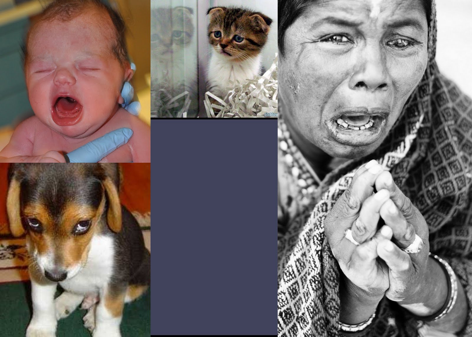
1.This is a photograph of my baby girl right after she was born. You can almost hear her cry by just looking at her sad face. It's heartbreaking.
2. I love this image of the kitten and its reflection on the glass. It induces a strong sense of sympathy and hope that someone will give this homeless feline a home.
3. The photograph of this woman, to me, is at the polar end of the sadness spectrum... It's agonizing. As a "reader" of the image, the message it sends is almost painful. It's an ideal expression of sadness.
4. I created this bluish-gray rectangle to express the emotion associated with this color. This is the color of rainclouds which are also associated with sadness and gloom.
5. This puppy is too cute. It illustrates the phrase "sad, puppy dog eyes" in a way the makes the reader just want to give the poor little guy a big hug.
Joyous

1. Nothing in the world could produce more joy than what I have experienced with the birth of my two girls. This image is of myself and my two girls soon after giving birth to my second daughter. It was my older daughter's first time meeting her baby sister. It was definitely a joyous occasion.
2. I love this colorful image of people who are "jumping for joy". It's exciting and moving.
3. This is my happy baby. I love her expression because it's greater than just a smile; it's true joy.
4. My older daughter was extremely excited about a present she got at Christmas time. I chose this image because of her incredible expression.
5. I liked this image of the girl with the stuffed bunny because of the excitement it invites.
6. The image of the word "joy" written in the sand actually produces a sense of joy in the reader. To me, the beach represents peace, content, and pure happiness. This is a great portrayal of that.
Uninspired

1. The first thought that came to me with the word "uninspired" was writer's block. There have been countless times in my academic life where I have been completely stuck in not-knowing where to begin for a writing assignment. A blank piece of paper and a tapping pencil is something I can relate to.
2. I chose to include this image of a photographer because, to me, it tells a story of a photographer without any inspiration. Here, he appears ready to take a photograph but either doesn't have any subjects to take pictures of or is unsure of what to take pictures of.
3. A blank canvas... One can assume the artist is lacking inspiration because nothing has been painted yet.
4. This black dress could possibly be cute on someone. However, I chose to include this because, to me, it's uninspired. There is no form, no unique design, no color.
5. I really like this image. The man seems lost, unsure, and uninspired.
Scared
2. I like the comic-like illustration of this image. It reminds me of older movies like the original King Kong- I would be afraid of a giant gorilla too.
3. Haley Joel Osment's character in the film The 6th Sense truly emits fear in the viewer. I chose this image from the movie because of the raw sense of fear it portrays.
4. One more movie image- this one is from Chicken Little. I included this image because the characters are scared of something and it induces fear in the viewer.
5. Lastly, this is my daughter covering her ears and looking scared. My husband was setting off loud fireworks which was a little scary for my girl, yet she couldn't turn away. It's funny how fearful things have the affect.
Tuesday, May 24, 2011
Another Ransom Note

I wanted to do one more "ransom note" journal entry because I had this idea of being your own kind of beautiful. When media, peers, and whoever else tries to influence you to dress a certain way, do a certain thing, or be a certain way... remember to always be true to yourself and be your own kind of beautiful.
Sunday, May 22, 2011
Entry Six: Ransom Note

"Recycle or nothing"
I purposefully chose organic elements to invoke in the reader a sense of appreciation for the beautiful world we live in. Flowers, trees, the world, is in our hands. It's up to us to do our part take care of our home... because if we don't, one day, there will be nothing.
Thursday, May 19, 2011
Entry Five: Office Signs Redesigned
Men & Women's Restrooms


Fire Extinguisher

Janitor's Closet

Executive Washroom

Parking Garage

Exit

I chose to identify the men and women's restrooms with fashionable clothing and stereotypical gender-assigned colors of blue and pink. I wouldn't mind seeing a whimsical, pink gown design in place of the stick-figure form any day. The fire extinguisher and the janitor's closet are directly correlated with what they represent. I used certain colors based on how I associate the items. he color yellow for the janitor's closet because they are how I associate the i
[After creating your new signs, write a few paragraphs about the symbols you’ve created. Also, discuss each symbol using design terminology. Consider the use of design principles, hierarchy of information, and color choices.]
Entry Four: Arrows

Outside of my home, I found more arrows. There were arrows on the garbage can and recycle to indicate which way to face the can (towards the road) for pick-up. There was also the recycle symbol (a triangular set of three arrows) on the recycle can. I found arrows on road signs that indicate which way the road turns or the area in which only certain individuals may park in the parking lot. I began looking "outside the box" and saw that an agave plant in my backyard had tall stems pointing upward as an arrow toward the sun. I found that many plants follow this same directional pattern; pointing upward, as an arrow stretching towards its target.
In Phil Patton's article Setting Sights on the Arrow, he mentions the universal use of the arrow symbol. Patton stated, "The arrow was assumed to be so universal that distant alien civilizations would understand it." The arrow is a simple, universal symbol that represents a direction or conveys a directive message. There is no doubt that it can be universally understood. As just one example, my husband works with individuals with special needs. Many of them are unable to read or speak so they use communication devices. Through icons and symbols such as arrows, they are able to understand and communicate messages.
I have found that I regularly use arrows as well. I draw them on the calendar to indicate until which date a certain event will last. I write them when proofreading or editing writing. I use arrows when creating sewing or scrapbooking projects. I use arrows to teach my preschool-age daughter left and right. The arrow symbol is easy for people of all ages and cultures to understand and for multiple purposes. It has been around for centuries and there is no question that it will continue to be used for centuries to come.
Entry Three: 15 Symbols (or more)

While searching for symbols or icons for this project, I realized how frequently we, as viewers, often only need an image to receive a communicated message. All of these icons I found are able to be "read" without any words. Some are symbols on signs learned in driver's ed class (or other driving instruction) but many of the signs are learned by associating the sign with the object it's representing. Colors, shapes, and images are important tools of communication on signs.
I found these signs: on household appliances and on other things around the house, while driving in the car, and at different businesses near my home. This is only a small amount compared to what we see everyday and have learned to "read."
Wednesday, May 18, 2011

Monday, May 16, 2011
Entry One: Who Am I?

While considering what symbol portrays who I am, I initially wasn't sure if I wanted to post something religious but when I thought about it I realized this is who I truly am. I decided to post this picture of the Gila Valley LDS Temple because of its multiple elements of symbolism.
First of all, my religion is who I am and one major part of my religion is the emphasis on the family. My family is everything to me and the temple represents that perfectly. The temple also represents attributes I hope to one day master: peace, love, humility, and more. It serves as a personal reminder to do a little better in all areas of life and to remember what matters most. Secondly, the snow-capped peaks of Mt. Graham and the incredible sunsets bring me back home. Where I grew up has carved who I have become.
How would someone else define me?
It's hard to say how others would describe me since I am so many different things. In addition to being a wife and mother, I am a full-time student. I decided to put this golden 'A' because everyone who knows me knows I am determined to succeed in school. There is a bit of "gold" personality that has shown through as I strive to do as well as I am capable to achieve my goal of graduating with honors. My need to receive A's isn't well understood by many people around me (i.e. my husband) who urges me to just get the job done with little consideration of the quality. By now, he knows very well that I try to take my time on school work to do it well. I used a script font because I don't have straight edges. I'm unique, versatile, and like to have fun. My husband appreciates that side a little more.

Subscribe to:
Comments (Atom)